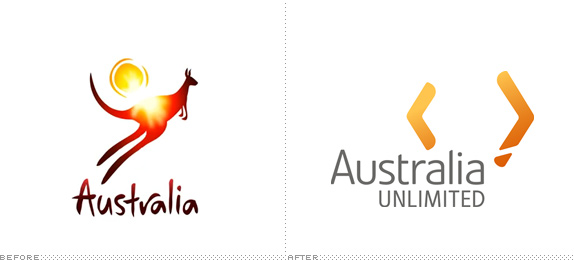
Brand Australia was conceived by the Federal Government of Australia as a four-year program to position Australia internationally as not just a pleasant place to holiday, barbeque shrimp and wrestle crocodiles, but also a nice enough place to perhaps invest a few dollars. And that's the key to understanding the place this brand is intended to take; it does not replace the tourism brand created by FutureBrand, rather it sits above it as the overarching brand for global citizenship, culture, business and investment. Confusingly, that same tourism brand created by FutureBrand had been in use as the business to business brand under license by Austrade — the government agency responsible for promoting Australia and Australian businesses overseas. Therefore, it's a before and after, whilst not being a before and after. Still with me?

In Australia, we have this thing called "cultural cringe." I could go on and on for ages about the origins of this phenomena, but that's why we have Wikipedia. Simply put, it's when a society thinks pieces of culture (movies, fashion, ideas, art) are inherently better when produced overseas, and locally grown culture develops an inferiority complex. Other countries have it, but we're much better at it here in Australia — stupid-crazy-good at it. It's this syndrome that no doubt will trap most locally grown designers into instantly disliking the logo, and that's the use of Boomerangs, a throwing implement used by indigenous Australians. Or in this case, Boomerangs as arrows. Or more specifically, Boomerangs as arrows as a map of Australia.

Designed by Re, a small group of brand designers valiantly operating out of the Sydney office of global ad agency M&C Saatchi, the mark, in my opinion, is actually a rather nice thought. The two boom-arrow-rangs form a stylised depiction of a map of Australia, and the designers were considerate enough of our smallest and least populated island state, Tasmania, to break a chunk of one boom-arrow-rang off to make sure it wasn't forgotten about. Something I'm sure they'll appreciate.

The boom-arrow-rangs speak of growth, expansion and movement, pretty admirable qualities in the business world. The two arrows are also intended to signify our eastern and western seaboard ports — an integral part of out most important industry — digging stuff out of the ground and shipping it off to whoever's buying. It's the 'clever bit' of the mark, but also for me, the most troubling. Consider this launch event quote from the Federal Trade Minister;
"We do punch above our weight, in so many ways. We know it, but the rest of the world doesn't. And quite frankly, being the quiet achiever, isn't going to cut it, anymore ... Australia is home to 11 Nobel Prize winners, it is the creator of the Cochlear implant, of Google Maps and internet WiFi. Ours is a great story, and it's well past time we should be so shy of telling that story to the rest of the world. We are more than a quarry and a farm. Australia Unlimited gives a brand beyond Made in Australia — it says I am Australian, and I'm proud of it"As a proud (if sometimes skeptical) Australian, that's pretty stirring stuff to hear, but for me, there doesn't seem much of that patriotic emotion in this logo. The burnt orange is an obvious allusion to our rich, resource laden dirt — very 'Australian'. But then, as a people, we're well known for being active, friendly and extroverted, with an irreverent sense of humour. None of these qualities are reflected in the mark, and are even more absent from the typography. Set in Linotype Veto in a warmish gray hue, the wordmark is a rather anonymous and ho-hum affair with just enough customisation to justify calling it a logo. It lacks presence and purpose, and does nothing to capture the Aussie personality that is so highly regarded around the world, and arguably our greatest brand asset.

With so little personality being delivered by the type, our attention falls back on the mark and the whole combination of the two really starts to fall down. In short: it's boring. There's a lovely duality to Australia: one of the oldest lands with one of the oldest native cultures on earth, mixed with a young, western style democracy with a diverse, multicultural and energetic society — and this mark simply doesn't capture that essence. Whilst perhaps an appropriate choice in the context of a business to business brand, one has to wonder if the B2B world really is such a joyless, uninspired place where business types never smile. If indeed it is, why not position Australia as a place where occasionally they do?


